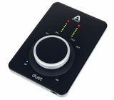
When I upgraded my MacBook earlier this year, I had my heart set on the Duet 3. I previously owned the original Duet and Duet 2, and really loved using them. However, after several months of using the Duet 3, I must admit defeat...I hate this audio interface.
Although the Duet 2's design was minimal, at least it had proper visual feedback on the unit (you always knew what the knob was controlling). The Duet 3 uses a small purple LED dot to indicate whether you're controlling speaker, headphones, or input 1/2. This has proved very fiddly and annoying, especially when setting mic/inst levels. There's a single left and right meter for either mic/instr input level (which combine for stereo playback). There are no numbers, and things can get confusing and irritating pretty quickly.
Also disappointing is Apogees silly decision to remove the assignable function buttons from the interface (for mute, dim, mono etc). These were really handy, and I used then all the time on the Duet 2. There are basically no controls on the Duet 3 besides gain/level adjustment.
So because of these issues, I really need to keep the Apogee Control 2 software open on my desktop permanently, and I control all my levels and functions from here (I almost never touch the interface). I might as well have bought a bunch of good preamps, it would be the same user experience.
The second big strike against the Duet 3 is the buggy firmware. This was an issue at times with the Duet 2, but it's even worse with the Duet 3. I keep all the software/firmware up to date (running M1 Pro MacBook on OS Monterey), but I still have to regularly unplug it/plug it back in because it disconnects or stops running the sound if I leave my computer for too long.
My impression is that the Duet 3 is not completely stable, and suffers from minimalist design taken too far. It's been a poor user experience overall, and I'm sad to say I'll be selling the unit. It's a shame, because the audio quality is great, but it's just not worth the aggravation .

